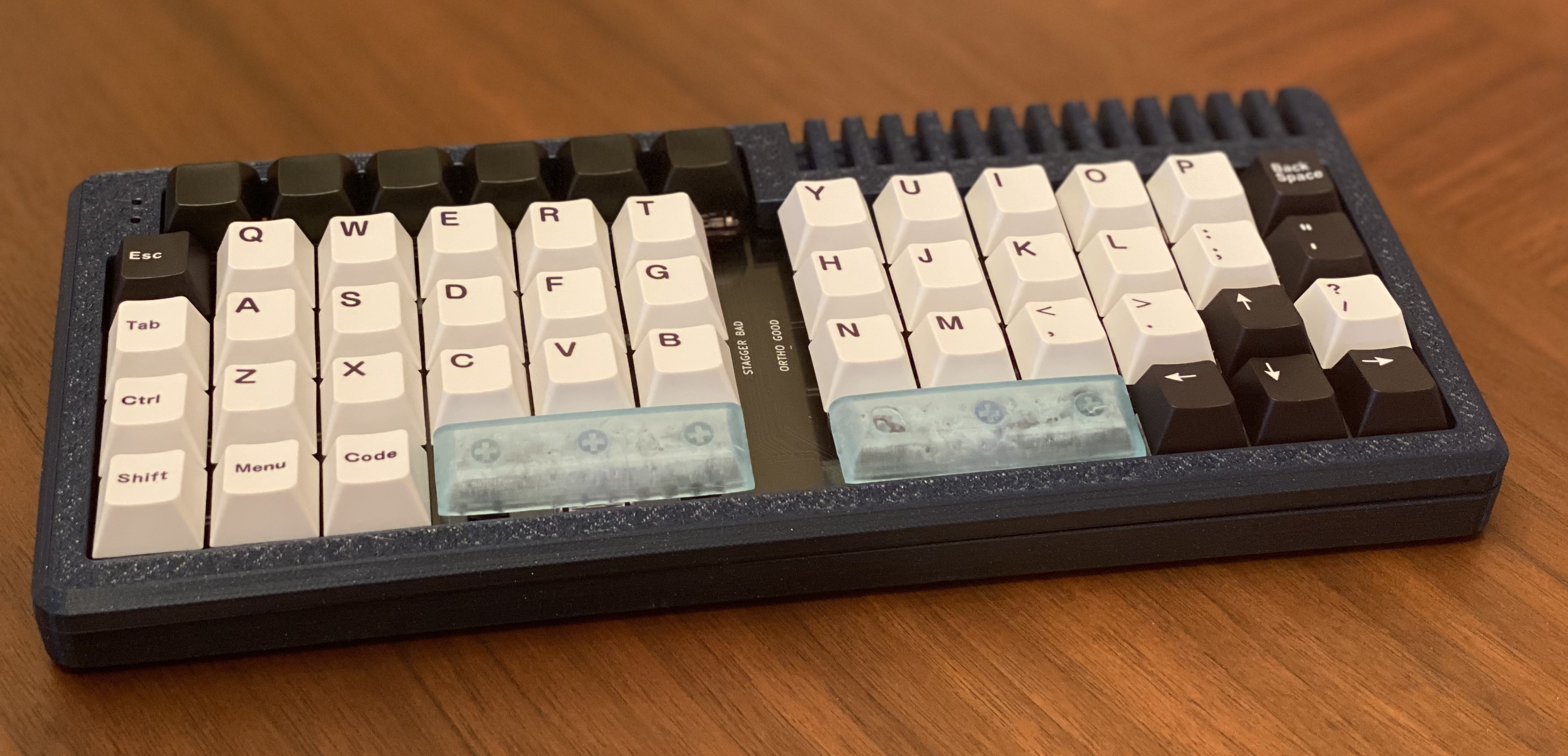
|<< :: Athena // IWA150 :: >>|
a replacement pcb for V4N4G0N, ortho-gonizing
anchored to [[461.00_anchor|461.00_anchor]]
| Overview |
The orig V4N4G0N is purely row-stagger, yet we ( Bonk / me) and probably others like orthogonal keyboard stagger too. Hence came the idea to create another replacement pcb to give the ability of an ortho drop in for the original case ( and its thousand variants).
The layout will likely be similar to this one :
https://trashman.wiki/community/pcbs/v4n4g0rth0n

Yet we strive for another mid decoration.
There were some initial thoughts of creating more space for iso-enter-placement or some other shenanigan, yet we may end up with the same layout as pictured above.
| Considerations | Naming
Athena is likely not going to be the final name of this pcb. As this whole pcb serves as drop-in for the V4NG0N, which is based of a car we cannot go into greek mythology. Well we could but it would be off regarding the theme.
Alternatives for names could be:
car/vehicle references:
- miata / mr2 ? –> don’t like them that much
- Wagon –> train reference
- DB-Baureihe 103 –> geiler E-Zug!
- UIC-Z-Wagen –> Wagon aus DR von VEB Bautzen
- Because we stick to vans –> IWA 150 (popular GDR van)
| Considerations | >> Design
[!Definition] First Design Idea The first idea takes advantage of the original underglow within the pcb. We leverage this ability and then allow a cutout in the middle to have light shine through.
There are some ways to implement this:
large cutout: ![[Pasted image 20231216233749.png]]
partial cutout ( with some ornaments / decoration maybe) ![[Pasted image 20231216233928.png]]
[!Definition] First Idea _Advancement: To prevent direct holes to the lower part of the case, we could position / attach some acrylic above this cutout in the middle.
Here it could either be positioned with an offset ( to match case-height) or be positioned directly above the pcb. one could also make an acrylic stack to fill this space, yet:
- mounting space is limited
a rough sketch of how that could look like: ![[Pasted image 20231216234154.png]]
| Considerations | >> Layout
There went some thoughts into improving the given layout to accommodate a more or less symmetric appearance, or to give more room for decorating ( by decreasing the amount of keys available per side).
Those are some layouts we came up with: ![[Pasted image 20231216234352.png]]
[!Tip] Option 2 as favorite As of now we favour option 2 so basically a .75u space in the middle with two blocks of switches left and right of it.